Accessibility and Innovation:
Redesigning a Complex Application
This project is a real-world case study. Due to confidentiality and data privacy agreements, I’ll refer to this product as an “e-Reader” and will use placeholder data in the screenshots.
Project background
The “e-Reader” was an outdated application designed for users to research legal titles. It was released in multiple countries, supporting various languages, and had received significant user feedback highlighting challenges with its usability. The main objectives for this project were:
-
Utilize the most recent company framework
-
Ensure responsiveness
-
Enhance accessibility
-
Maintain consistency with other research platforms from the company applications
The team
The team was a diverse group of professionals from various nationalities, including Developers, Project Managers, Product Owners, UX Designers, and UX Researchers. Working with such a talented group was a pleasure. We held weekly meetings for working sessions where we clarified questions, conducted design thinking exercises, and performed design reviews and refinements.
Getting hands dirty
In this project, I had the opportunity to develop an effective UX team workflow that was later adopted by the entire team for other projects. Our workflow, though simple, was highly efficient, covering everything from the discovery process to delivery and including UX-focused quality assurance. You can see the workflow in the image below:

My main responsibilities included creating the interaction design, developing the information architecture, and providing Portuguese-BR translations. At times, I also led the team, worked on the UI, and, following a change in our project manager’s responsibilities, took on additional project management duties. These included managing meetings, handling new tasks, and overseeing UX deadlines, which provided valuable new experiences.
We had the freedom to delve deeply into every aspect of the application, which allowed us to deliver an outstanding product that I am extremely proud of. For this article, I will focus on two key features that were particularly engaging and where I invested considerable effort and creativity. I will also compare the old application with the redesigned version.
Feature 1 – Table of contents
The Table of Contents (TOC) is undoubtedly one of the most critical features for an e-reader, and it was an area we paid close attention to. The legacy TOC had several issues. It displayed each level as layers, meaning that if a user was at level 6 and wanted to jump back to level 1, they had to navigate through all the intermediate levels, which was time-consuming. Additionally, it was not very accessible, leaving keyboard users potentially stuck. Below is a representation of the old design:

After several rounds of brainstorming and design thinking, we developed two primary concepts. The first was a refined version of the old TOC, allowing users to quickly navigate back to previous levels. However, this approach limited users' overall view of the content, hindering comprehensive research.

The second option resembled a tree structure, allowing users to freely collapse and expand levels. This approach enhanced navigation for researchers. However, the primary drawback was potential confusion due to varying title lengths.


With this in mind, we presented both options for user research, conducting an A/B test with approximately 15 users from 6 law offices. In the end, the second option emerged as the clear winner. Based on the research insights, we proceeded with this feature, which is now highly appreciated by users.
Feature 2 – Annotations
The Annotations feature allows users to add notes or highlights to text and bookmark pages. While I did extensive work on the information architecture for this feature, I will focus here on how I made it accessible for colorblind users.
The product offers 7 different colors to aid research. Given the constraints of our design system, I had a limited color palette to work with and couldn’t deviate significantly. Here are the colors I had to use:

However, it is known that colorblind individuals have a very limited color spectrum recognition, and different types of color blindness affect the visibility of specific colors. This makes relying solely on colors for conveying information problematic. According to WCAG rule 1.4.1, we cannot use color alone to represent visual information.

That’s why the cards include color labels and tooltips with the corresponding color names. This approach ensures that users with color blindness can still distinguish between different colors and use the feature effectively.


But the real challenge was ensuring that highlights were distinguishable for colorblind users. To address this, I added various border styles. To validate these changes, I consulted with a coworker who is colorblind. After a productive discussion, we refined the border styles to the following:

Now, this solution is easily noticeable for everyone. However, it could potentially be frustrating for users with normal vision. To address this, the borders are implemented as an optional setting that users can enable or disable according to their preference.

Additionally, the application features three different background colors for reading. I had to ensure that the annotations did not present any color contrast issues with any of these background color schemes. Here’s how it looks:

Final Design
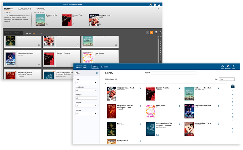
I know you might be curious to see the final design of the application. Here, I’ll show you a comparison between the old and new designs. The following images display the differences between the old design (gray) and the new design (white). The first image compares the library view, while the second image shows the title view.
Library View
Title View

I could spend hours detailing all the differences, but that’s not my primary goal here. If you’re interested in discussing this further or exploring other topics, feel free to send me an email. I’d be delighted to continue the conversation.